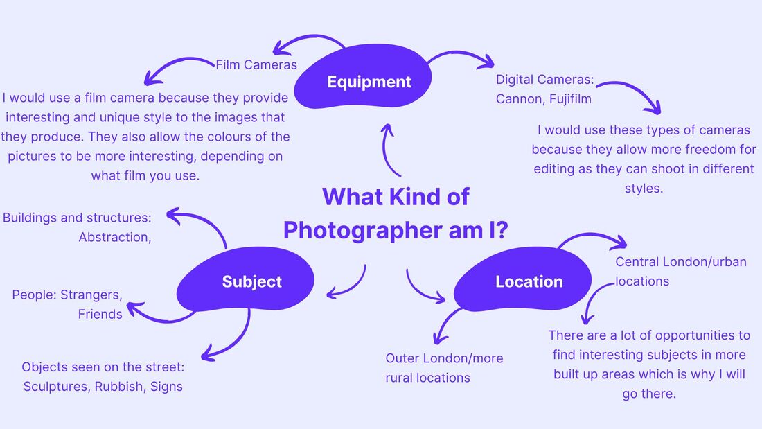
Mind Map
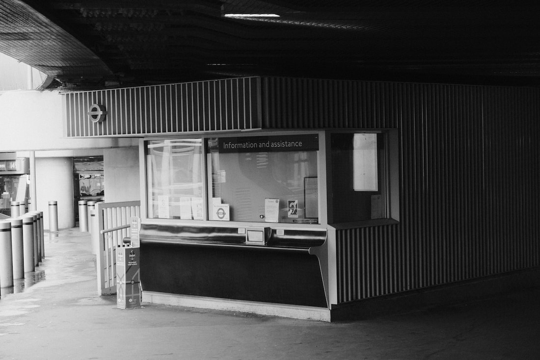
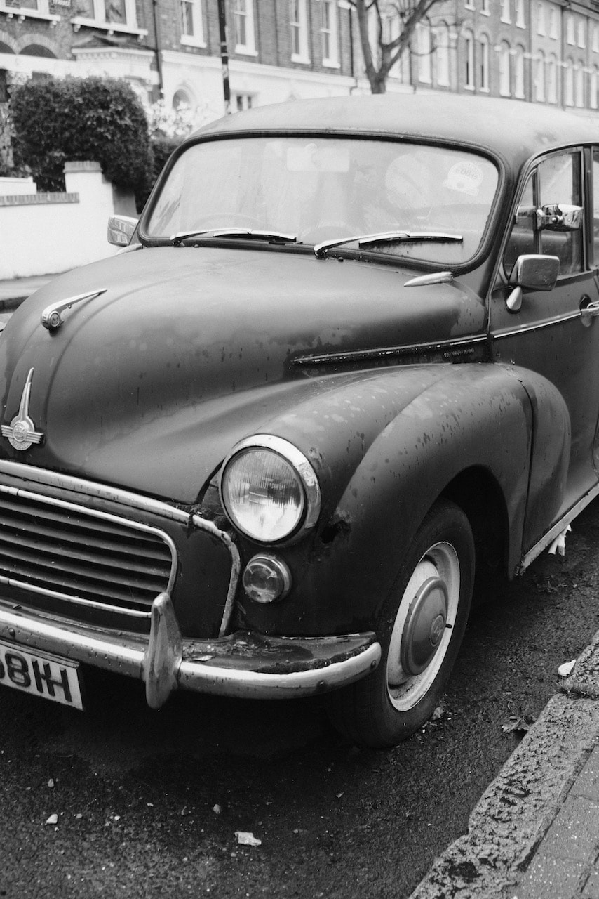
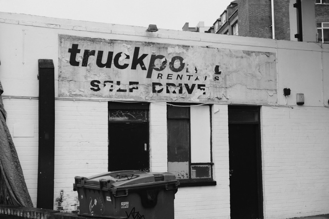
Some of my favourite photos so far
These are some of my favourite photos that I have taken since the beginning of the course in September 2022. I believe that they represent the style of photography I tend to lean towards. I also like these pictures because of their difference in style, with some being black and white and some being more colourful.


Photobook analysis: Units by Seth Lower
This book presents a series of photos that show the different things Seth Lower has seen on the street over the course of roughly 23 years. The cover is very simple, its is a vibrant yellow with one of the photographer's images on it. It also has the photographers name as well as the title of the book, with both being in very bold and blocky letters.


When first reviewing this book I realised that the subjects of the images is relatively different in each image, with the focus being on different things, however, the photos still link to one another in their own way. They are documented in a way that allows them to be seen in a similar way, for example there is a photo of two framed pictures of eyes, while two circular cacti accompany it on the opposite page. These two photos could be seen in the same way as they both look fairly similar. The fact that there are only 2 images on each spread allows you to focus more on the images that are being presented and the connection between them.
The subjects of these photos are all very simple and would be things that you would usually see around during your day to day life. However, they are photographed in a way that makes them interesting to look at, as well as making the viewer question what they are looking at and how it interacts with the world around them. The photos feel very minimalistic and thought out while also feeling like they have been taken while the photographer was out on a walk. The image on the cover of the book is a good representation of the other photos in the book as it shows the simplicity of the images in the book while also showing how the things we pass in our daily lives can be seen in a much more interesting an unique way. This links to the font of the text used in the book, it is a very simple and bold font that the photographer, like the images in the book, makes interesting and it draws people to the book.
Overall I think that this book is very interesting and that it presents interesting ways of sequencing images as it links images that you wouldn't think would work together. I think that the thing that makes me want to look at it again is the fact that there is more to the images than you would originally think, meaning that you would have take your time with the pictures and examine how they work alone as well as how they work with their accompanying picture.
Kidbrooke Dérive


A dérive, which translates to 'drifting, is the art of exploring an urban location without any specific destination in mind. It allows people to explore places that they may not have usually explored and see things that they otherwise wouldn't see. The people that would partake in a dérive would let their interest in something they see determine where they travel to. Psychogeography is a very similar act which allows people to connect with their surroundings better, building up stronger relationships with their local area, or an area that they are new to.
This task involved walking around the local area without a certain destination and taking pictures of the different things we saw that interested us. I think that the photos I took are fairly similar to ones that I have taken before. However, I also think that some of them are slightly different to the style of photos I usually take, such as the close up photo of the drawing on the railing. I didn't feel very out of my comfort zone during this task as this is the approach to photography that I usually take, although I did feel that I learned a bit more about looking at my surroundings in a certain way. I think that these images were my most successful, however, they could have been improved by ensuring that the lens was clear of water drops which would have made the images clearer and better to look at.
This task involved walking around the local area without a certain destination and taking pictures of the different things we saw that interested us. I think that the photos I took are fairly similar to ones that I have taken before. However, I also think that some of them are slightly different to the style of photos I usually take, such as the close up photo of the drawing on the railing. I didn't feel very out of my comfort zone during this task as this is the approach to photography that I usually take, although I did feel that I learned a bit more about looking at my surroundings in a certain way. I think that these images were my most successful, however, they could have been improved by ensuring that the lens was clear of water drops which would have made the images clearer and better to look at.
Teju Cole
This video from photographer Teju Cole examines how is view of the world changed and how he became more aware of the beauty that surrounded him after he lost his vision in one eye. He ultimately recovered and regained his vision but his experience meant that his view on the world remained the same. The photographs that he took whilst having this different view on the world were put into his book "Blind Spot". This book presented a series of photographs that focused more on the less interesting things that we see in the world and the things that we would usually pay no attention to. Most of the pictures in the book come from when he was travelling to different countries for literary festivals, exclaiming that when they are linked with words and sentences is when the book becomes alive. The book uses both images and words to express its meaning, and while the words don't always match the pictures, they help with the understanding of the book and the idea that it is presenting to anyone that reads it. They also help with the feeling that the images are more than just images and that they have stories behind them. Some of the pictures have poems beside them, such as the first image in the book, which allows them to gain more depth and interest as they end up becoming more than just pictures.


Exhibition - The Photographers Gallery


I went to the photographers gallery and saw an exhibition that had a few photos taken near where I live. I found this very interesting as I don't usually see photos or exhibitions that take place in the area I grew up. The exhibition, "A Brief Revolution: photography, architecture and social space in the Manplan project", contains photos from multiple photographers that were taken at different places throughout Britain during the late 60's. The photos explore the change in architecture and how peoples living conditions changed over time.
Teacher strike 2023


I decided to go to the teacher strike to give myself an opportunity to take types of photos that I haven't taken before. I quickly understood that there was always something that I could take a photo of and deciding on what would be the best thing to photograph was an interesting challenge. When I was taking these photos I was trying to present each subject as best I could by not only showing what was on their signs, what they wearing. etc. but I was also trying to make the photos look good and not become too crowded. This meant that each one had to have a specific subject within them instead of just taking a photo of a sea of people.
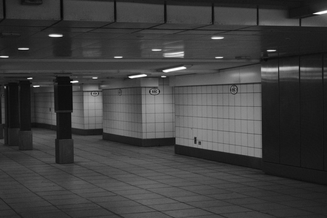
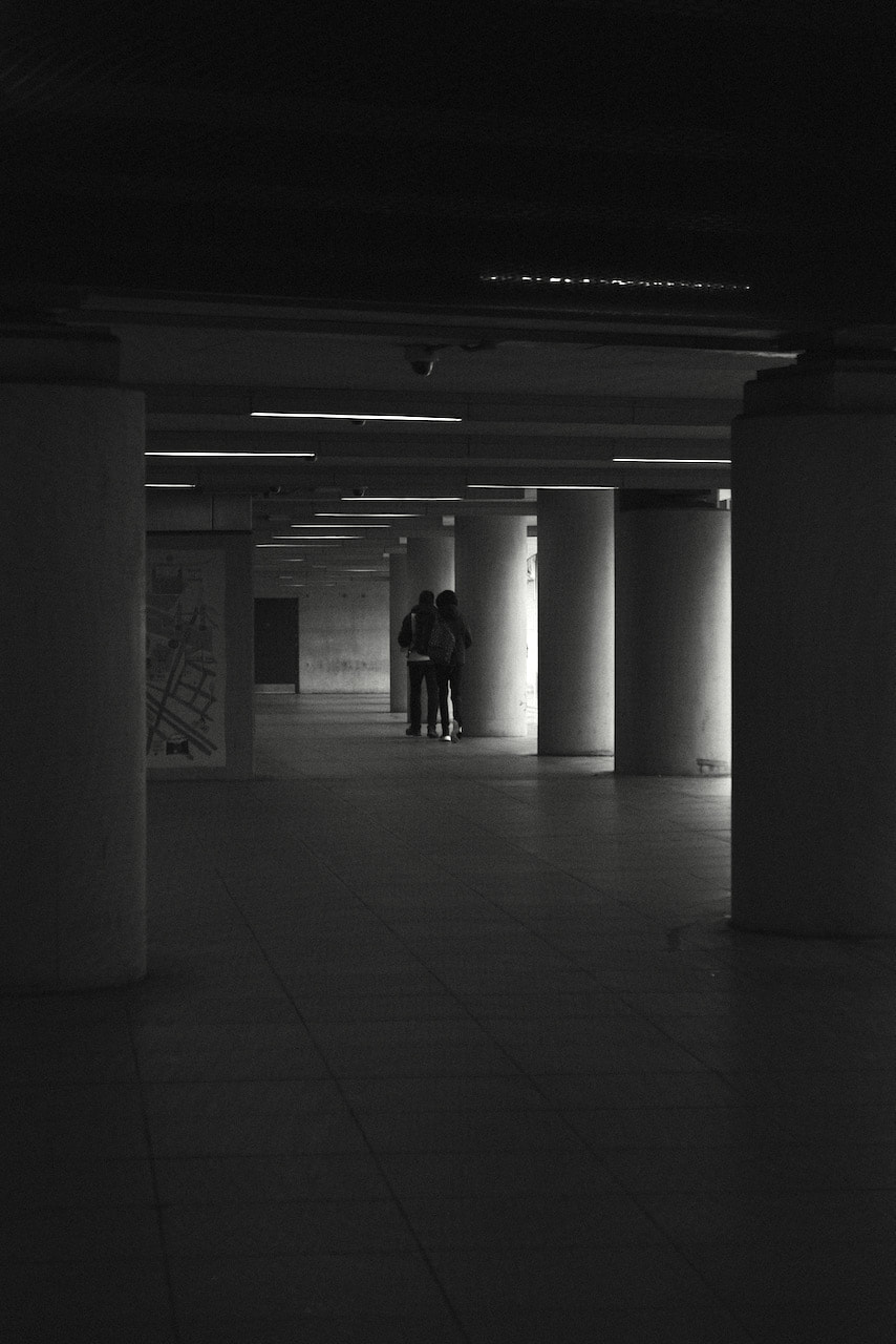
One hour Dérive
For this Dérive I spent an hour walking around Central London, taking pictures of the things I found to be interesting. I allowed my interest in seeing certain locations guide me through the city and I was sure to document some of the things that I saw.
I like how most of these pictures turned out, however, I think that I could improve them by editing the exposure and the colours of the pictures to make them a bit more interesting to look at.
I like how most of these pictures turned out, however, I think that I could improve them by editing the exposure and the colours of the pictures to make them a bit more interesting to look at.


Artist Research - Bertrand Cavalier
|
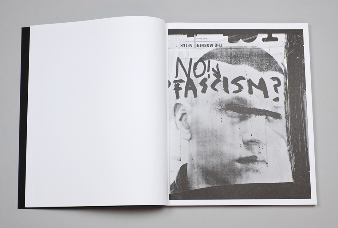
"Concrete doesn't burn" is a book that explores the political upheaval in urban landscapes becomes visible as well as how it affects the lives of the people that live in these areas. Mainly focusing on areas that have been affected by armed conflict in the past and how for a lot of people this is the world that they have to live in. The way he photographs the people and places allow the usually subtle effect of politics to become more prevalent to anyone who sees the photos.
I think that the photos in this book are very interesting and unique in the way that they present the issues they explore. |
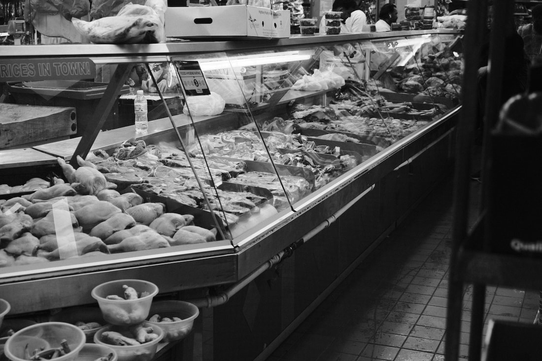
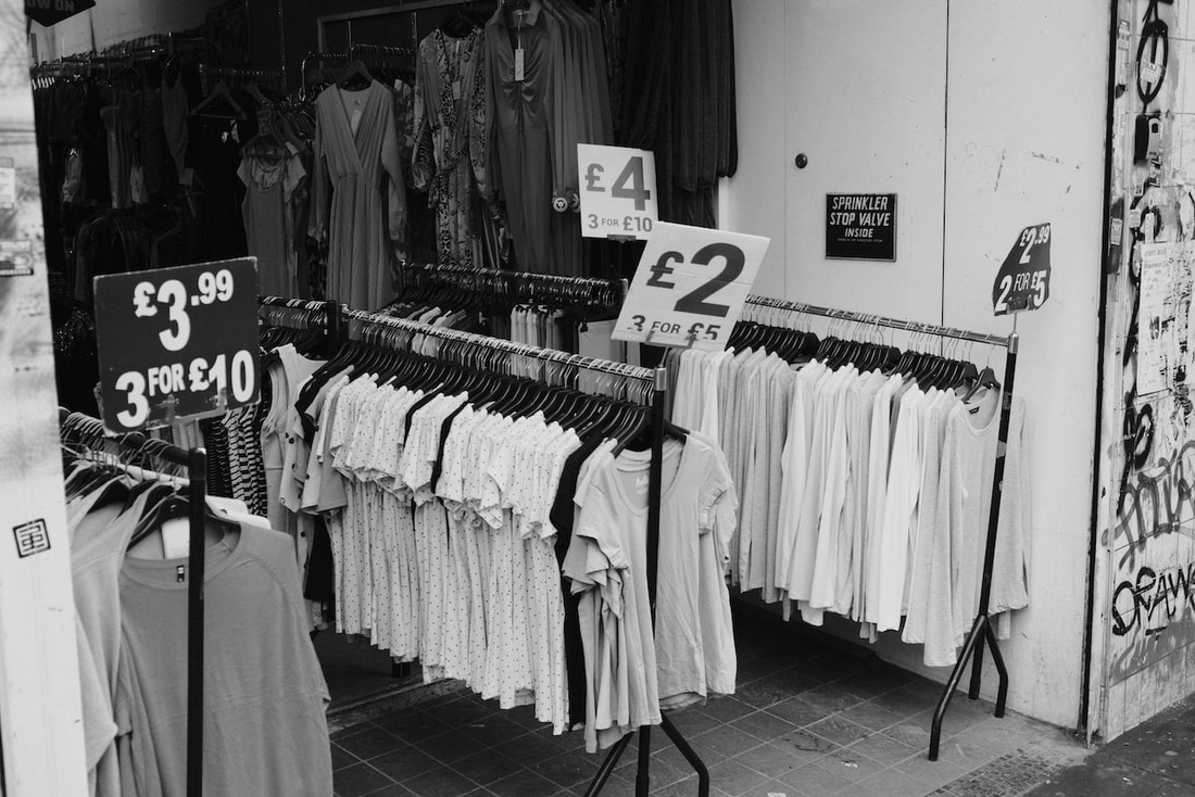
Making Day Photos
Original Photos
Final 36 Photos
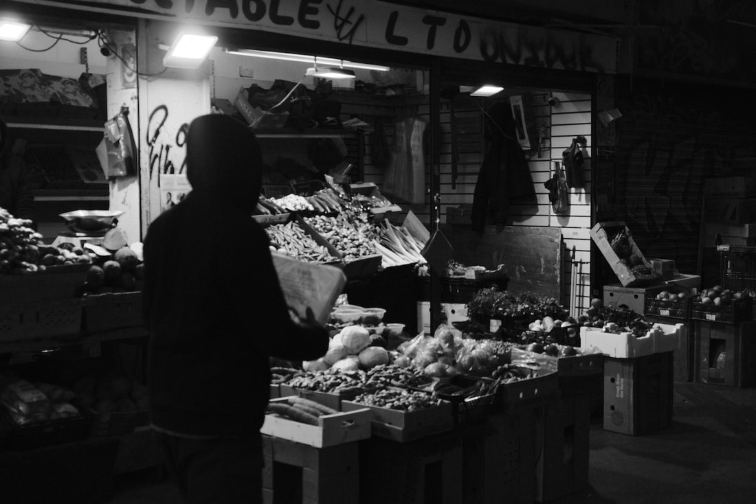
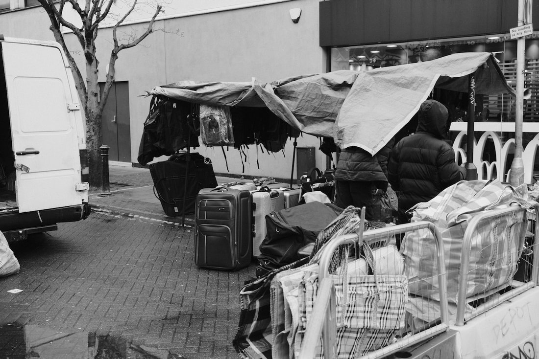
These pictures are the pictures that I believe are the best 36 from the photos that I took. I like that there is a range of different styles from picture to picture, with some of them being simple shots of market stalls to others being closer up or a bit more abstract. I also think that shooting in black and white improved the quality of the photos as it meant that I didn't have to worry about the lighting as it was quite cloudy, meaning that the lighting would not be very nice anyway. I also think that it makes the photos easier to look at as it keeps them simple due to the fact that some of the photos are fairly crowded.


Reflection
I decided to walk from Peckham to London Bridge, taking photographs of things that I believed were interesting. I decided to go here because I was interested in the variation of streets and buildings and how the area changed as I got closer to the city centre. I chose to use a fujifilm camera for these photos as they take good black and white photos, as well as the fact that it can replicate the style of film.
I think that working with the constraints of time and place meant that I had to look out for more things to take photos of to ensure that I had enough while also making sure that the the photos were up to a proper standard.
I think that working with the constraints of time and place meant that I had to look out for more things to take photos of to ensure that I had enough while also making sure that the the photos were up to a proper standard.
Medium Format Workshop


I recently took part in a workshop that taught me how to load, shoot and develop medium format film. This workshop also taught me how to use and read a light meter to ensure that the photos were not too over or under exposed. I think that these photos came out well as they all have the right amount of exposure, with none of them being too bright or too dark.
35mm film Photos


Richard Learoyd
This video focuses on how Richard Learoyd takes photos of things that have been taken photos of many times before. He explains that he would wait for the right time and the right lighting in order to get the picture to come out as good as possible. He also explains how he was drawn to the larger views of scenery as he thought that they were the most relevant and they allowed him to review his photography process and how he could allow it to differ from other peoples and make his work unique from the rest.
Paul Graham
|
vimeo.com/135761365 In this video Paul Graham explains the meaning behind his collection of photos entitled "American night". He explains the different styles of photos and what they represent, with the bright and overexposed pictures representing the invisibility of the lower class and how they have become almost an afterthought within the world. he also explains the fact that photography can be used to mimic the way people see the world, as well as their state of mind. He made the photographs in this way to show how people need to see past their original thoughts and look harder at the image, doing so will allow them to notice the people and the details of the world that the photo has captured. This then contrasts with the clear and vibrant pictures of upper class homes in the California desert that allow us to see every detail clearly and with ease. |


|
Razy Faouri
|
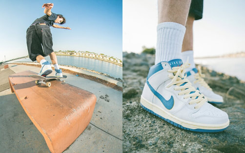
Razy Faouri is an American photographer that specialises in a more commercial style of photography, photographing anything from skateboarding to editorial magazines. I plan to focus more on his skateboarding and portrait work as this is what I am planning on doing for my personal investigation. I really like the use of a fish eye lens on some of his photos as I think it provides an interesting effect to the photos that makes them look less static and more like someone is moving within them. I also like how he pairs some of his photos with photos of the shoes that the person is wearing, and I plan on doing something similar.
|
|
His portrait work is also very interesting as he uses both black and white as well as colour when taking them. His portraits are also set up and only a small few of them are candid photos. I like the simplicity of his portraits and how they are largely untouched in terms of techniques that may affect the outcome of the photo. I really like this photo as I think that the background works well with the colour effect that the film provides. I also think that the framing is nice as you can clearly see the subject of the photo while also being able to see background elements that help make the photo more interesting to look at. |

|
My personal investigation
For this project I plan on expanding on a previous project that I did where I took photos of skateparks and people using them. This time I plan on taking portraits of skateboarders. Some of the photos will be just people and others will be of people with their skateboards as it shows the uniqueness of each person and how they choose to express themselves with their skateboards. To explore this idea further I may ask people why they chose to use that design and how they believe it represents them. I plan on taking these photos with colour film as I think it will provide a better look for the photos due to the colours that it can produce. I think that producing this project in the form of a book will work best as I think it would be easier to present any writing that I am going to put in it with the photographs that may accompany it.
- Take photos using a macro lens of the damage on peoples boards
- Take conventional portraits of skaters with the background being blurry and the persons face having detail
- Could present the photos in a way that allows people to try and link the pictures of the board with the portraits
- Take photos using a macro lens of the damage on peoples boards
- Take conventional portraits of skaters with the background being blurry and the persons face having detail
- Could present the photos in a way that allows people to try and link the pictures of the board with the portraits
Summer Work
During the summer I took some more photos connected to skate/street photography. Most of the photos that I took were focused on graffiti and the style of skateparks and how the people that use them have changed them to fit their style. I chose to use black and white as it forces you to look more into detail at what the graffiti includes instead of just the colours of it. This also makes the photos fit into a more documentary style as it emphasises the detail in the photos instead of just making them a purely visual form of viewing the culture.
There are also other photos here that don't show anything to do with skate culture or skateboarders. I took these because I wanted to try and show the differences between skate culture and the rest of the world. However, there are also some pictures that show potential similarities between the two and how art can be used as a form of expression between all cultures around the world.
These photos were taken on a Yashica FX3, I chose to use a film camera as I felt like using film could help with the 'Documentry' style of my images, as if they where taken in the early days when skateboarding was just starting off and was first beginning to become more popular. I also think that using film can help immortalise this era of skateboarding as it takes in and stores the exact light that was there at the time of photographing it, meaning that in the future the photos will be showing exactly what the culture was like and not just a copy of it.


These are some of the photos that did not come out very well. This is mainly due to the fact that the camera I used took the photos a few seconds after I pressed the shutter release button. Even though the photos did not turn out great I feel that there is still something to learn from them. That being the fact that even though a camera is the main tool of a photographer, there can still be a divide between the camera and the photographer and that relationship can still be hindered. I also still believe that I can use these photos for something in my project, for example the first photo in this group is a photo of a load of damaged skateboards and even though it is not the clearest photo I think that it can still be used as a part of my project.
