John Baldessari
John Baldessari was a conceptualist artist that worked in many different mediums throughout his life. He would blend photography, paint and text together to create his work, allowing it to be unique and stand out from the works of other people. He aimed to present the narrative potential of images by editing them in a way which would present the smaller things in the picture that people wouldn't usually look at. An example of this is his famous dot pictures, by covering peoples faces Baldessari aimed to present what the photographs were really about instead of who was in them. Adding dots to the faces makes the viewer focus on the smaller details of the photograph and makes them realise what it was really taken for. I think that Baldessari wanted to 'instruct' students using a list because he was interested in the way that they would interpret them. I think that he wanted to see the way that the students minds would deconstruct the instructions and how they would react to them individually.
Experiment #1


The instructions for this task were to take pictures above, below or over different objects.
At first I was intrigued by this task as I didn't know how it would affect the way the pictures would turn out. I thought that they would be fairly simple instructions to complete however I eventually found out that finding interesting things to photograph was harder than it had originally seemed. overall, i found the task tricky but rewarding as it allowed me to further understand how I process instructions.
I think that these photographs turned out well as they accurately responded to the instructions I was given. I also think that the lighting improves a few of these pictures and it allows the subject of the picture to stand out more. However, I also think that these photos could be improved. I think that the angle of these pictures could be improved as some of them are tilted or off center.
Experiment #2

For this experiment we had to order the pictures we had taken into a sequence, combining pictures that were similar to each other. These sequences could include pictures with similar colours, meanings, layouts or focuses. We were encouraged to create a meaning behind our sequence so that it would become more interesting and unique.
Georgia O'Keeffe/Alfred Stieglitz collaboration
These two artists began their collaboration work when Stieglitz showcased some of O'Keeffe's work in one of his exhibits. O'Keeffe had sent some of her work to a friend in New York who eventually showed it to Stieglitz, in 1916 he decided to showcase her work in one of his exhibits. After this they began to work together, collaborating on many pieces of work.
I think that their collaboration work allows them to functionally present their two styles in one piece of work. it allowed O'Keeffe to present herself in a way that she was unable to do in her own work.
I think that their collection of images are an interesting way of presenting their relationship. I also think that they are fairly clear to understand, however, they can sometimes be unclear and confusing to look at.

I think that this image is the most successful image from their collaboration as it presents the contrast of styles between the two artists. O'Keeffe's style is presented through the fact that the focus of the image is very clear as well as the fact that it is a simple photo with not much happening. Stieglitz's style is presented through the fact that it is a portrait as well as the fact that there is a significant lack of colour, whereas O'Keeffe's work is usually full of colour.


Hicham Benohoud


Hicham Benohoud's classroom series is all about staging and collapsing the distance between the photographer, the subject and the viewer. He had students create a performance with props from around the classroom and then photographed them doing that while the rest of the students act like nothing is happening. He chose to use students for this project as he was inspired by his work as a teacher and he believed that it would be a good way to present an allegory for the cultural and religious taboos in Moroccan society. He also allowed them to break through the behaviour that was imposed on them by society. Benehoud cleverly uses lighting in these photographs in order to highlight certain areas and draw the viewers attention to the focus of the picture.
My Response
- I took these pictures using multiple different styles.
- Some of them were more successful than others in terms of lighting.
- I think that the framing of these pictures is good.
Scarti


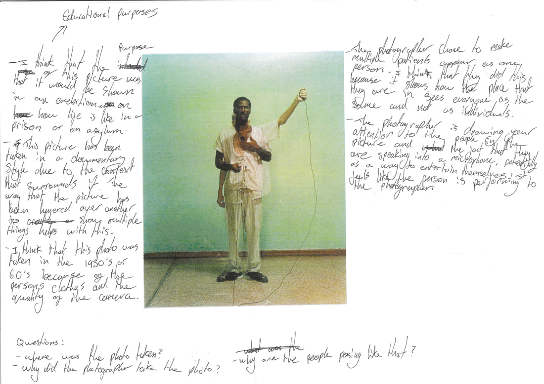
Scarti is a photo book made by Adam Broomberg and Oliver Chanarin. It is consists of a multitude of pictures that have been mashed up into a single image. All of the pictures were taken in a variation of locations which were drastically different from each other. a few of the 12 different locations these pictures were taken at were: a maximum-security prison in South Africa, a retirement home in California and a refugee camp in Tanzania. This photo book was made to show the differences in 'gated communities' around the world and how people live there as well as how they are treated differently in each place. Some of the photos originally came from a previous book the pair made called "Ghetto" which consisted of singular images that didn't have any other ones overlapping them. The pair decided to take these photos and create another book with them. This time they chose to layer the pictures with other pictures that they had taken to create the effect that we can see.
I like this photo because I think that colour has been used effectively to focus the viewers attention on the tree and the people sitting in it, as well as the fact that the use of the double exposure technique doesn't make the image harder to look at or more uncomfortable but instead it adds to the photo and the sequence as the next photo in the book has an image of a different part of the arm, allowing it to look like it is reaching across the page.
I like this photo because I think that colour has been used effectively to focus the viewers attention on the tree and the people sitting in it, as well as the fact that the use of the double exposure technique doesn't make the image harder to look at or more uncomfortable but instead it adds to the photo and the sequence as the next photo in the book has an image of a different part of the arm, allowing it to look like it is reaching across the page.
Fictional Character Photographs

For this task we had to write about a fictional photographer. We then had to take a set of photos in the style of that photographer and pretend that we were them. This task was designed by Adam Broomberg and Oliver Chanarin. It is typical of their work as they usually stick to a certain style however they do sometimes switch it up a little and photograph different subjects.


I think that these pictures have turned out well as they respond properly to the instructions that I was given. I also think that the framing of these pictures are very good, they present the main focus of each photo while still having other subjects. These photos respond to the task that I was given as they show urban environments as well as seemingly empty and abandoned buildings and locations, they were also taken using film which is what the photographer uses. There are also double exposure photos which is something that the photographer I was imitating likes to do. overall I am happy with how these pictures turned out as I think they responded well to the instructions and they look good.
Experiment #1
For this task we had to:
- Make an image with your camera that creates a mood
- Make a portrait of something you love
- Make a portrait of something you hate
- Recreate a dream or thought in a series of 10 photographs
- Create an image that asks questions
- Make an image where the subject is out of frame


Experiment #2


Coming up with ideas for this task was a little bit tricky but I think that I was able to respond to it properly. The photos were taken to represent gloominess and tiredness as well as a little bit of happiness. I thought that it was a little tricky to translate the emotions through photos but I believe these ones represented them perfectly. The pictures are grey and empty which provides a depressing and gloomy feel to them.


These pictures are a continuation of experiment #2, however this time I decided to go for a less gloomy feeling to them and focused on the happier aspects of how I was feeling at the time. The images come across as warm and bright, with most of them using the sun as an interesting use of natural lighting.
Liam Wong
Liam Wong is a Scottish Photographer largely known for his cyberpunk style of photography. He primarily takes night time photographs around Tokyo, ranging from the middle of the city to the suburban outskirts. He decided to take up photography so that he could learn more about colour, contrast and composition to help with his game design job. He uses canon digital cameras as well as different phones. After taking the pictures he will then edit them in Lightroom to make the different colours stand out and contrast with each other.
To make a series of pictures in this style I am going to go into London when it is dark and take pictures of streets and train stations that have a lot of interesting and bright lights. I will then put them into Lightroom and edit them so that the colours are brighter and more contrasting.
To make a series of pictures in this style I am going to go into London when it is dark and take pictures of streets and train stations that have a lot of interesting and bright lights. I will then put them into Lightroom and edit them so that the colours are brighter and more contrasting.


This video shows the process of creating 'After Dark'. In the video he explains how he took the shots and the what he used to do it. All of the shots in this video were taken with his phone, they were then colour graded after so that they would give off the desired colour.
My Response


These photos were loosely inspired by the work of Liam Wong, however, they aren't that similar due to the fact that they were taken during the day, meaning that the colour is not as good. They were also only take at school so I was unable to properly get the same kind of style in terms of the angle of the buildings. To improve upon this response I will take photos in a more built up as well as a brighter place, such as central London. I will also edit them so that they give off more colour, as well as contrasting more.
Masashi Wakui
Masashi Wakui is a self taught Japanese photographer that focuses on urban Japanese landscapes. He uses a wide range of digital cameras when taking photos, such as the Sony ILCE-7RM4 (his primary camera) and the Ricoh IMAGING COMPANY, LTD. GR. After taking the pictures he will edit the colours to make them appear more vivid and magical. He began his photography journey in 2012 after he discovered a camera that allowed him to fixed images of shots that had been filmed in high definition.


I plan on using both digital and film cameras when responding to this photographer as I think that by doing both I will be able to achieve a similar effect. I will also edit the photos after I have taken them to ensure that the colours become more vivid and outstanding.
I am very inspired by the colours of Masashi Wakui's photographs. I think that they give off a very relaxing feeling as they have very warm colours. I also think that the subjects of his photographs are very simple, however, he manages to make the pictures interesting to look at. The reason his simple photo subjects inspires me is because it is something that it possible for me to do. Wakui often tends to take his daytime photographs whilst the sun is setting which helps add to the warm colours that are prominent in his pictures. Doing this also allows the contrast between the colour of the sun and the colour of the buildings to be clearly shown as most of the buildings that appear in these photos tend to be darker, more greyish colours.
Wakui often adds a yellowish tint to his nigh time street photography to give it a more unique and unusual feel. By editing the colours of his pictures he is also making them feel like they are almost surreal. This effect is increased by the fact that his pictures have a lot of light in them which makes the yellowish colour all the more prominent, this could be understood by the fact that in his night time photographs that aren't as lit up he decides to edit them in a different way, making them feel cooler with the bluer tints that he uses.
Masashi Wakui night style Lightroom tutorial: https://www.lightroomtutorials.com/how-to-achieve-the-masashi-wakui-look/
This video presents some of Masashi Wakui's work and the simple yet interesting nature of the photos that he takes. One of the main things that makes his photographs interesting is the framing that he is able to effectively combine with editing to create unique and artistic photographs out of fairly simple subjects.
My Responses
I edited these photos in Lightroom by changing

I think that this article is correct with both of its statements as the concept of photography is fairly simple whereas the act of developing a style and refining your work is a lot harder than people may think.
This relates to my work as I have had to refine my photography style in order to achieve my desired outcome for different projects.
This relates to my work as I have had to refine my photography style in order to achieve my desired outcome for different projects.
Darkroom Experiments
I recently did some experiments in the darkroom after we had a printing workshop, where I used one of my negatives from a previous shoot that I had done. I used an enlarger to print the negative onto a piece of photographic paper that I had cut in half in order to not waste resources. The process of developing the prints was to first expose the image onto a piece of photographic paper for an amount of time that depended on what image was being used. After that the photographic paper would be put into the developer bath which allows the image to show up on the paper. You would then put the paper into the next bath, the stop bath. This stops the chemical reaction from the first bath that allows the image to show up, ensuring that it doesn't become too dark. After that the stop bath has stopped the reaction from taking place, the paper will then be put into the fix bath. This bath ensures that the image won't fade from the paper, allowing it to stay on there for a long time. The longer the paper stays in the fix bath for, the longer the image will stay on it. After all this is done you then wash the paper in some water and peg it up to dry.

The first prints that I did came out too dark as I had exposed them for 11 seconds which was too long, however, I had planned on exposing them for a longer amount of time as the original picture is quite dark. However, the pictures were very in focus which means that they didn't come out as bad as they could have.

I then experimented with exposing the picture onto the photographic paper for less time, this time for 9 seconds. I believe that this was my best one as the exposure time was a lot better as it kept the image slightly darker as it was supposed to be while also having enough light in it to allow everything to be seen. I also think that this was my best print because it is very in focus and the whole image came out very clear, meaning that all of the details can be seen.
After I finished experimenting with printing on smaller pieces of paper, I wanted to make a print on a larger piece of photographic paper. However, after exposing the image onto the larger piece of paper for 9 seconds, I realised that I would have to expose it for less time as the first print was too dark. Because of this I decided to expose the image onto the paper for 6 seconds, however this print was too bright. I then decided to expose the image for 7.5 seconds which allowed it to come out with the correct amount of exposure.
After I finished experimenting with printing on smaller pieces of paper, I wanted to make a print on a larger piece of photographic paper. However, after exposing the image onto the larger piece of paper for 9 seconds, I realised that I would have to expose it for less time as the first print was too dark. Because of this I decided to expose the image onto the paper for 6 seconds, however this print was too bright. I then decided to expose the image for 7.5 seconds which allowed it to come out with the correct amount of exposure.

Large print that was exposed for 7.5 seconds onto photographic paper
